Creative Typography
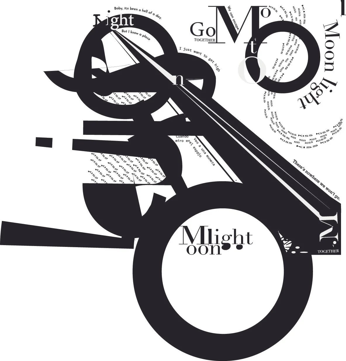
This poster was created in Adobe Illustrator as part of an exploration into the balance between form and function.
By deconstructing traditional letterforms and rearranging text in dynamic layers, I aimed to create visual rhythm and emotional resonance without relying on imagery.

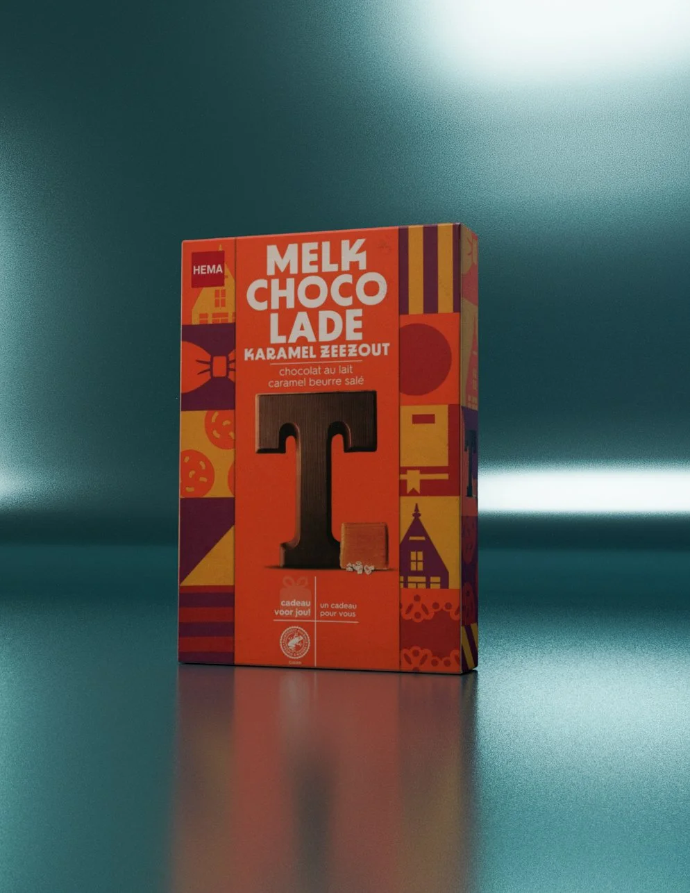
3D Design
Using Autodesk Maya, I developed a 3D concept from the ground up, focusing on form, lighting, and texturing to produce a realistic, high-quality render.
The project combined foundational design principles with advanced 3D modeling techniques to create professional, market-ready visuals.
Careful attention was given to material details, scene composition, and light dynamics to ensure the final output was both visually compelling and technically refined.


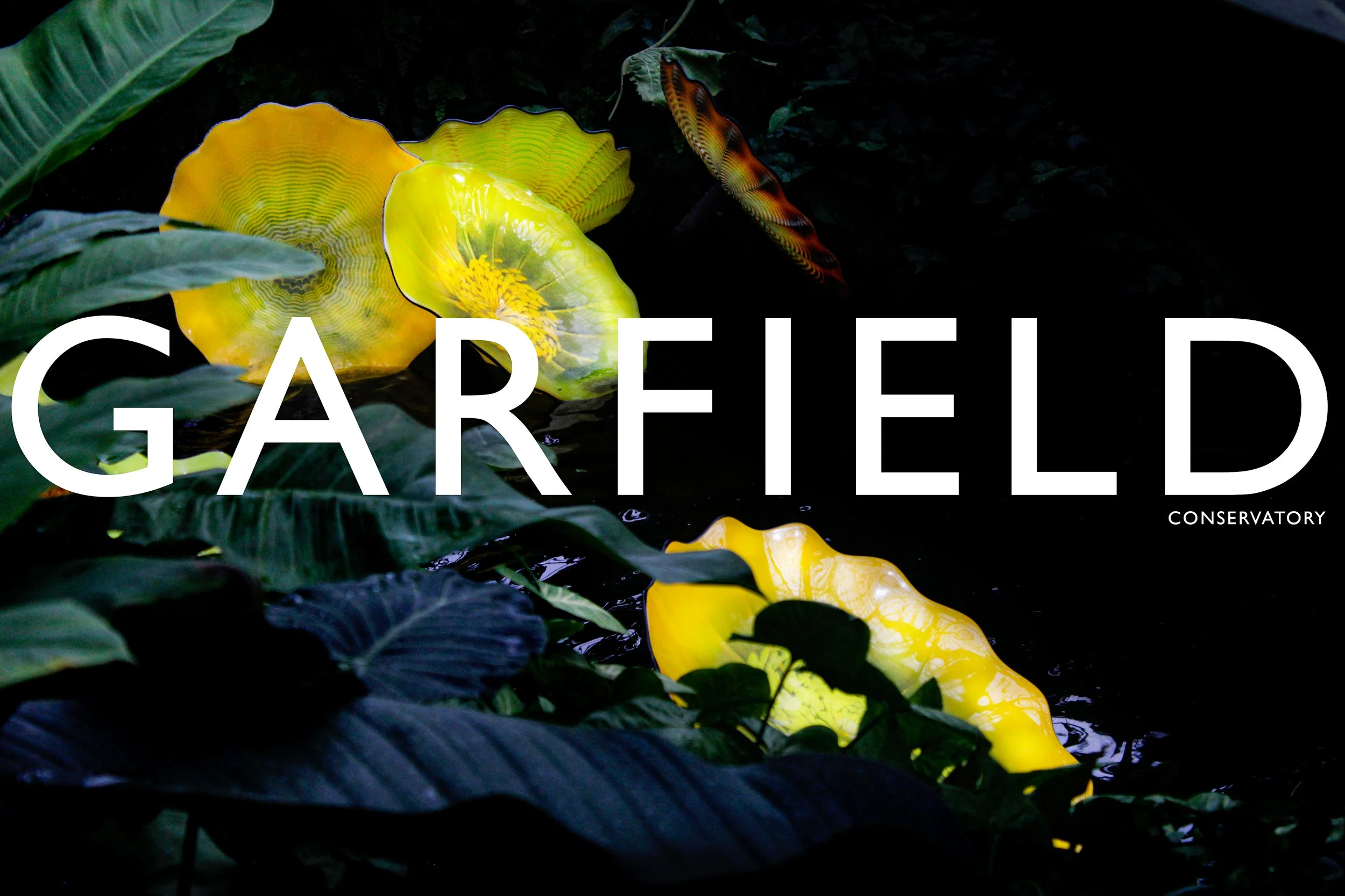
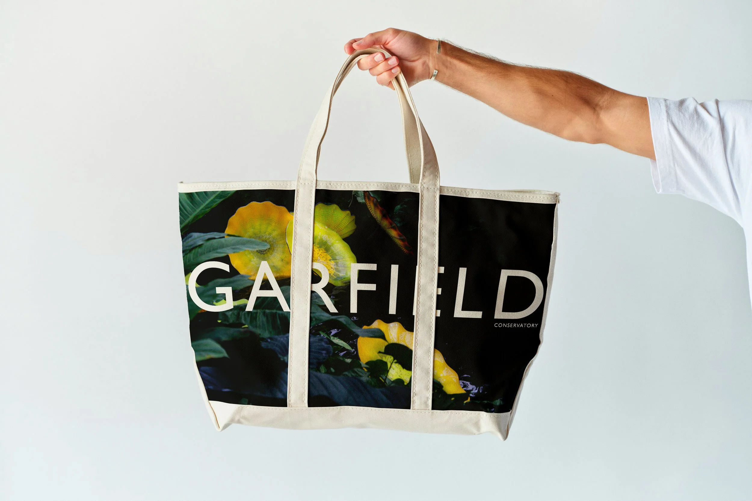
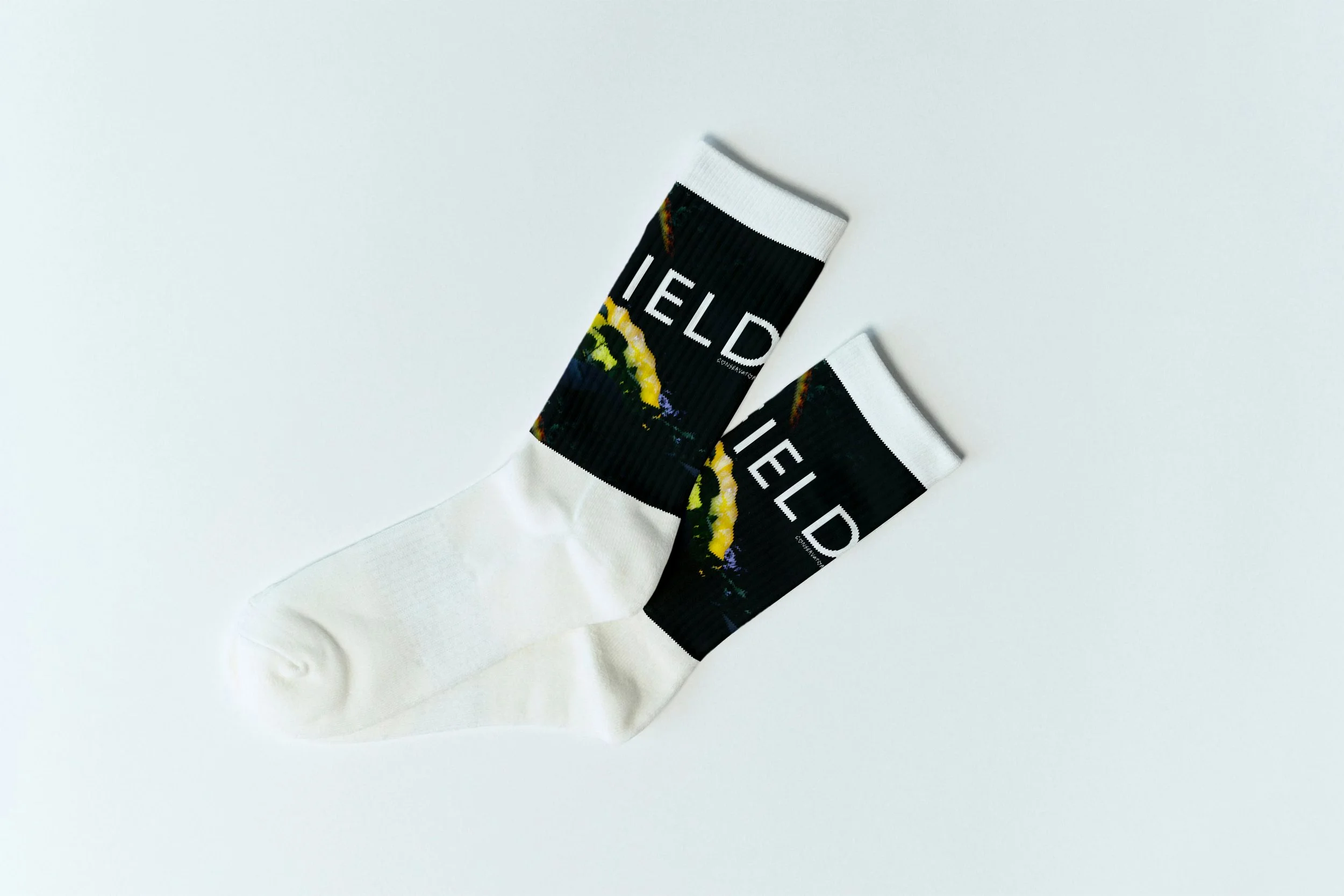
Created for Garfield Park Conservatory
This project began with the challenge of crafting a visual concept that reflected the brand’s identity. I started by immersing myself in the brand’s existing visual language its tone, values, and aesthetic—and used that as a foundation for creative development.
I produced original, high-quality photography, carefully styled to match the brand’s mood and message. Using Adobe Illustrator and Photoshop, I created a series of custom graphic elements that could live across different products.
The result is a product collection that not only looks visually unified but also feels like an authentic extension of the brand.

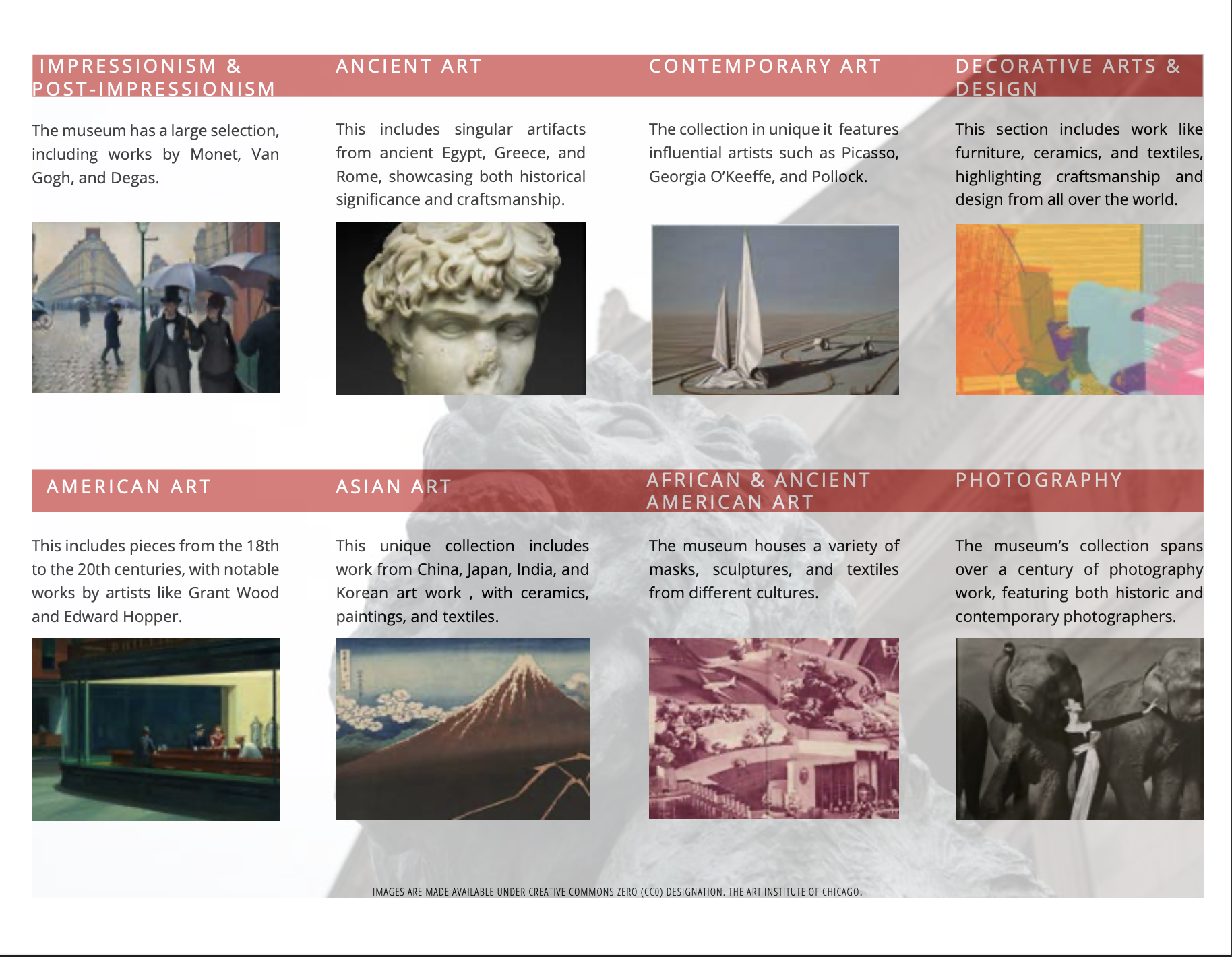
Created For The Art Institute of Chicago
This brochure was designed in Adobe InDesign as a visual and conceptual extension of a museum’s identity. From the beginning, my goal was to create a layout that felt both structured and expressive—capturing the spirit of the institution while delivering information clearly and beautifully.
I developed a consistent grid system and applied principles of color theory and typography to guide the reader’s experience across each panel. Every element—from type scale to spacing—was chosen to reflect the tone and elegance of the museum’s brand.
To bring the design to life, I incorporated my own high-quality photography, selecting images that captured the atmosphere and artistic richness of the space. The result is a brochure that not only communicates clearly, but also invites viewers into the museum’s world—blending design strategy with personal creative vision.


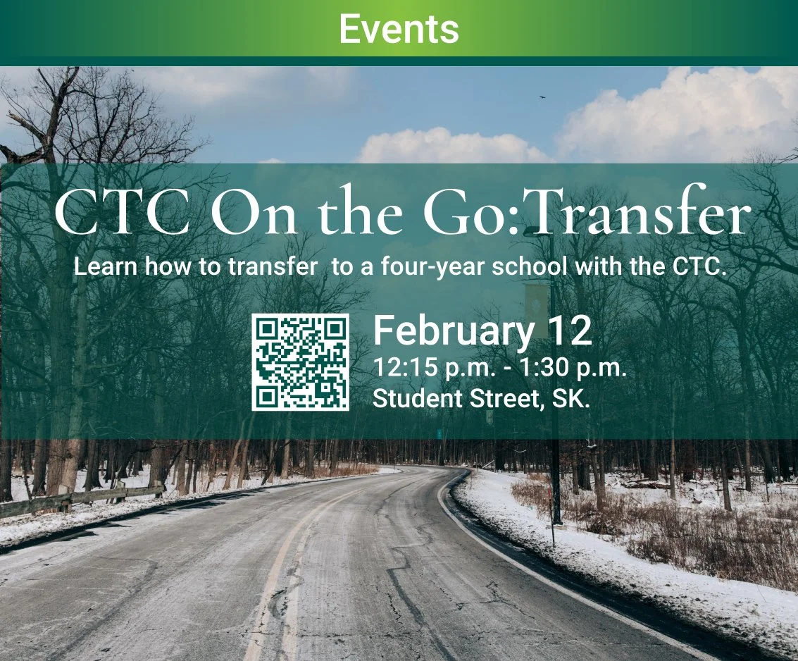
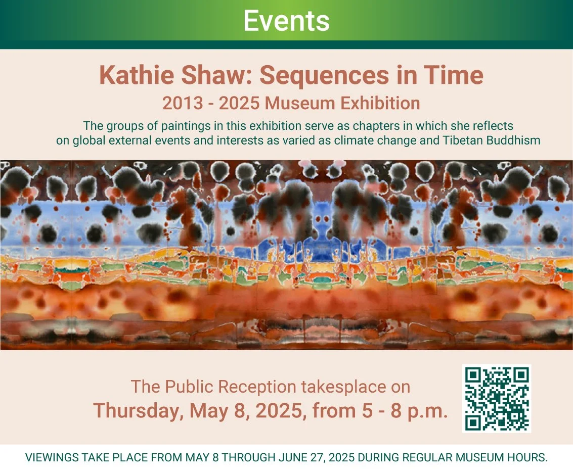
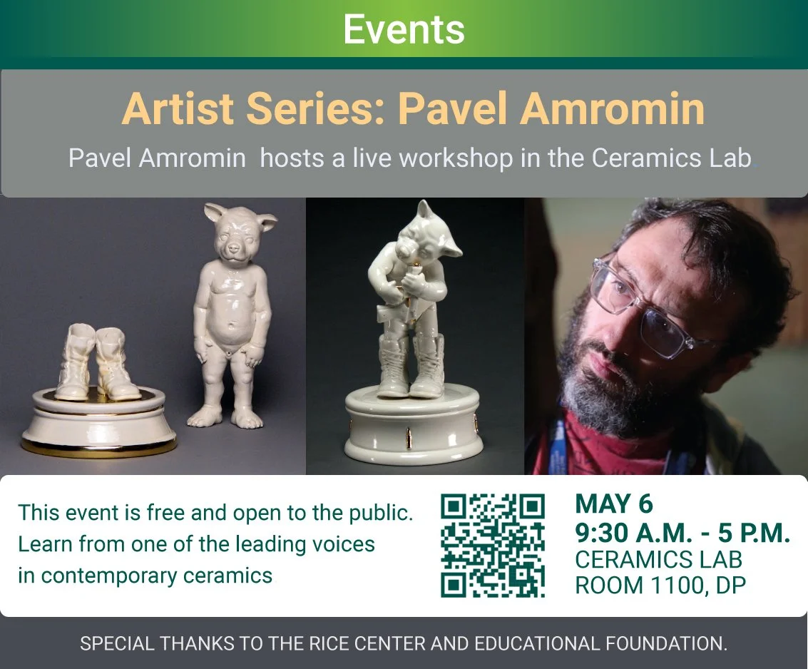
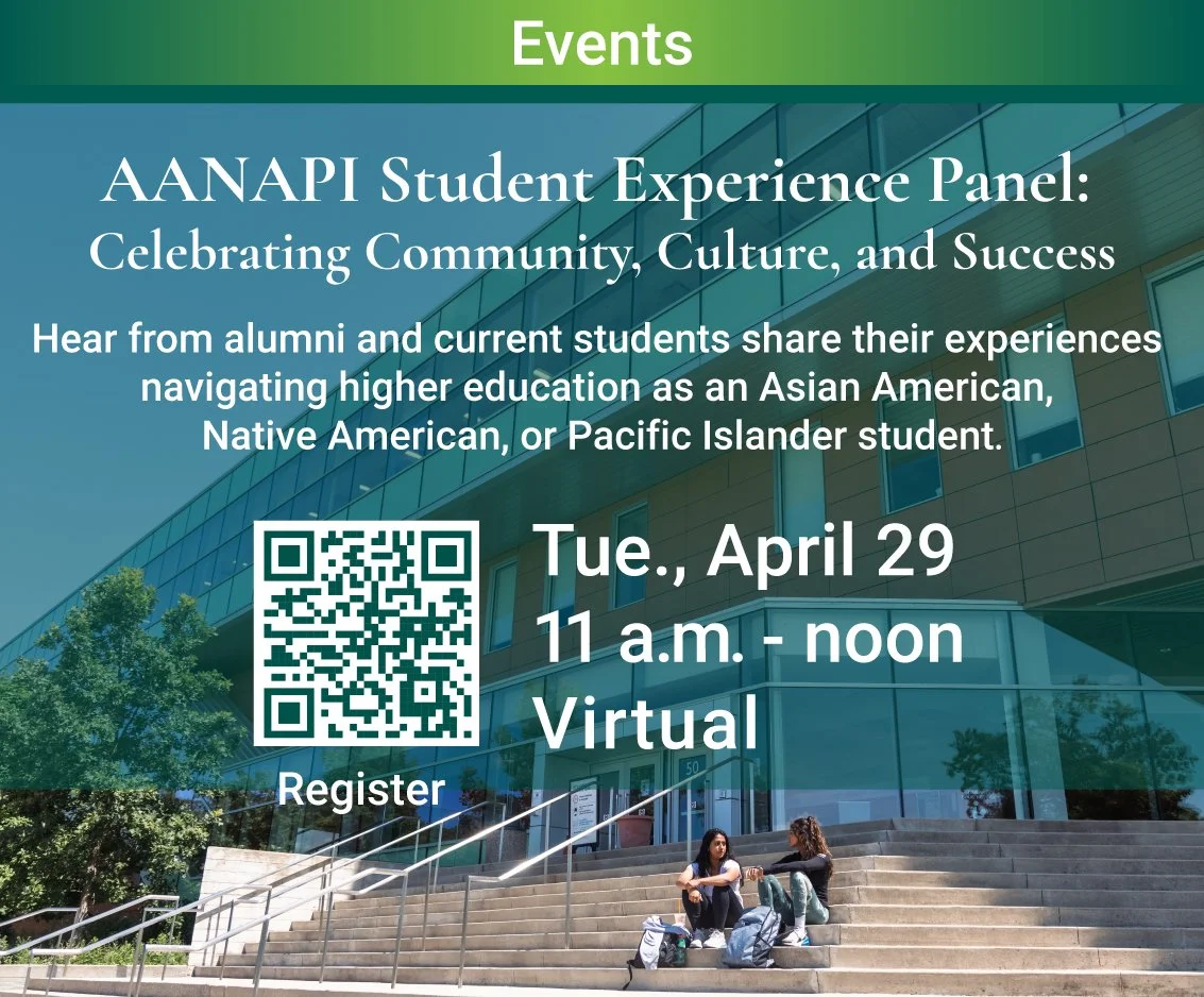
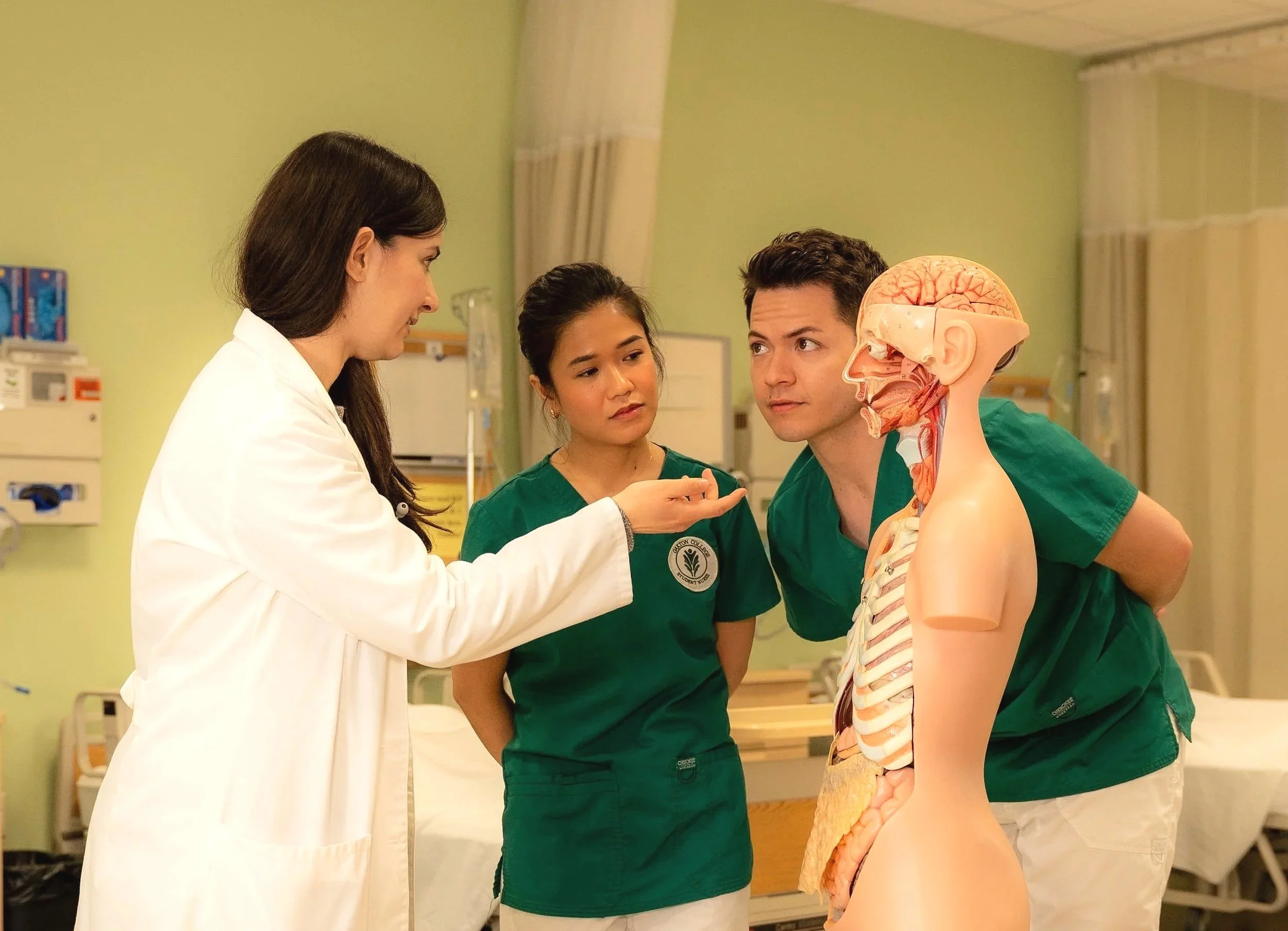
Dynamic Digital Displays
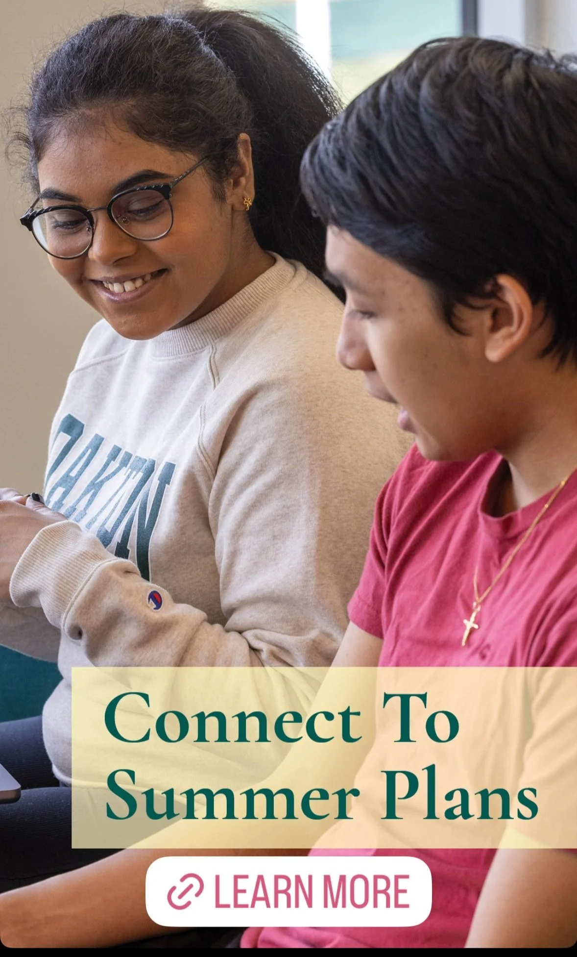
During my time at Oakton College, I was responsible for designing and developing a series of digital monitor displays aimed at keeping the campus community informed and engaged. These monitors were strategically placed throughout the college and featured rotating content such as upcoming events, student resources, and important campus updates.
My role involved creating visually appealing layouts that aligned with the college’s branding, while also ensuring clarity, accessibility, and ease of readability. I managed dynamic content updates on a regular basis, adapting the designs to stay current and relevant. This project allowed me to combine communication strategy with visual design, helping strengthen campus-wide engagement through thoughtful, well-executed digital media.


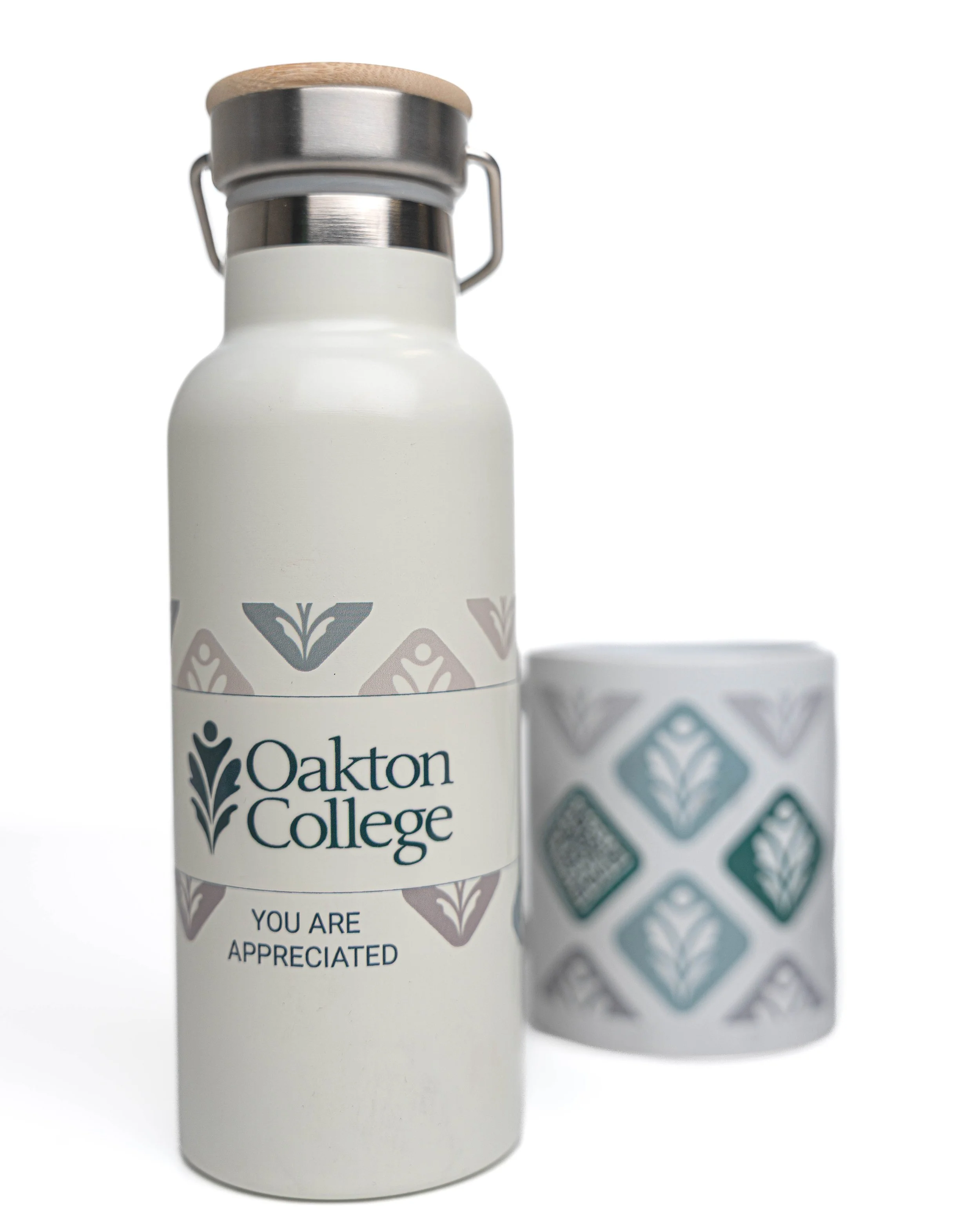
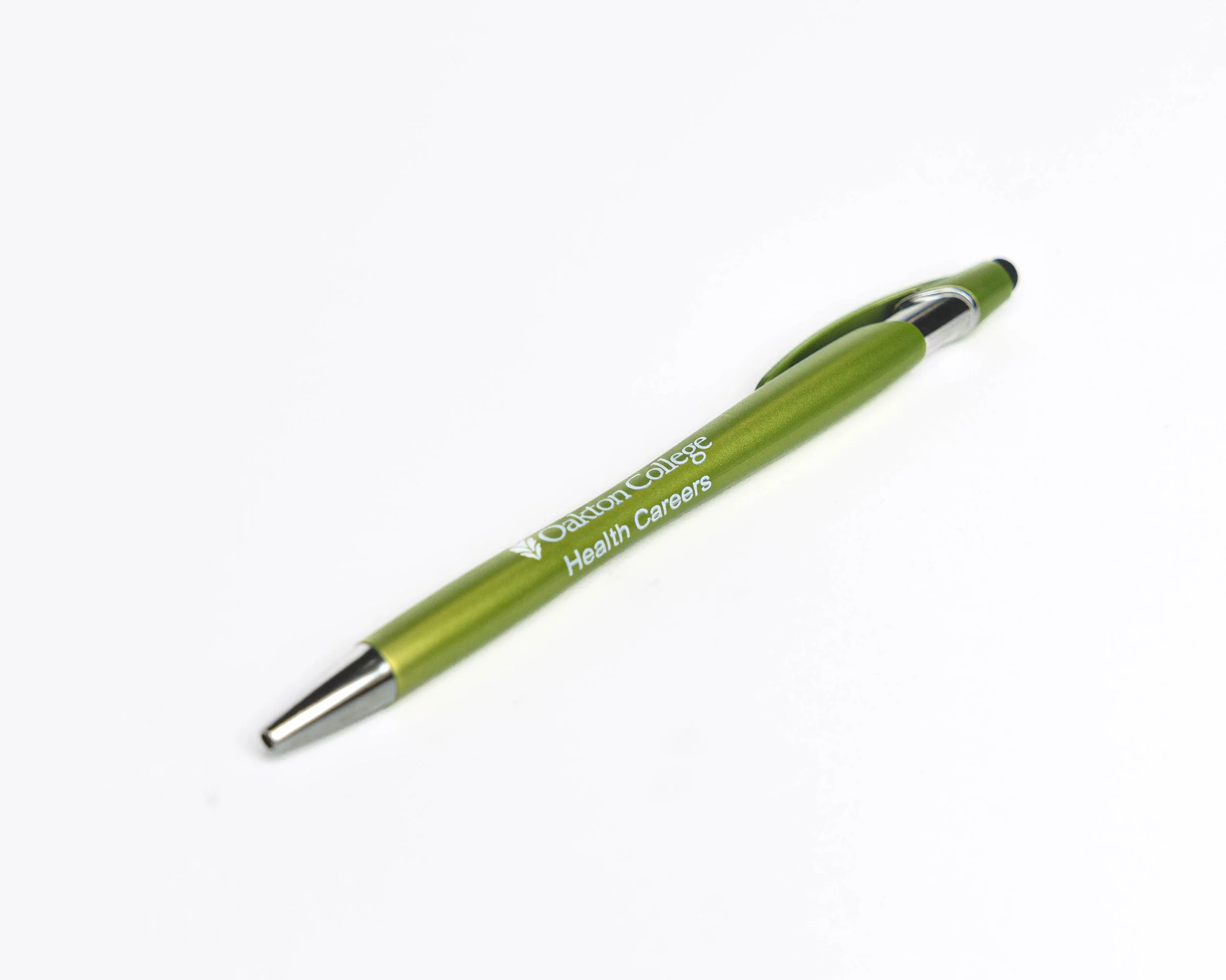
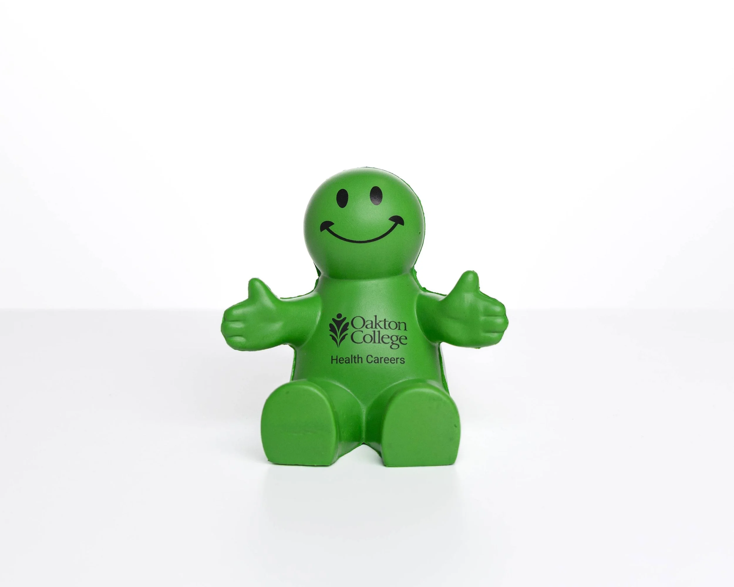
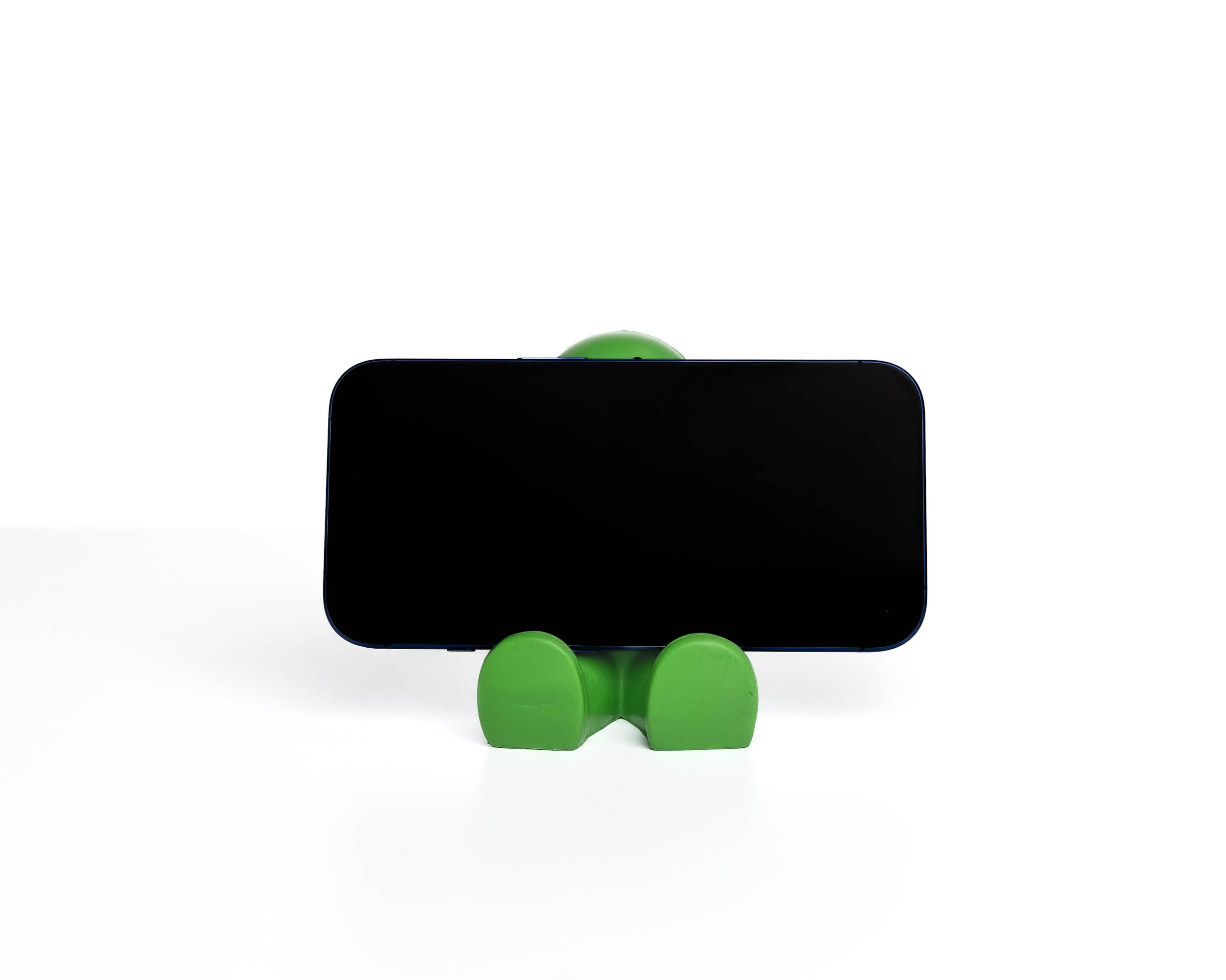
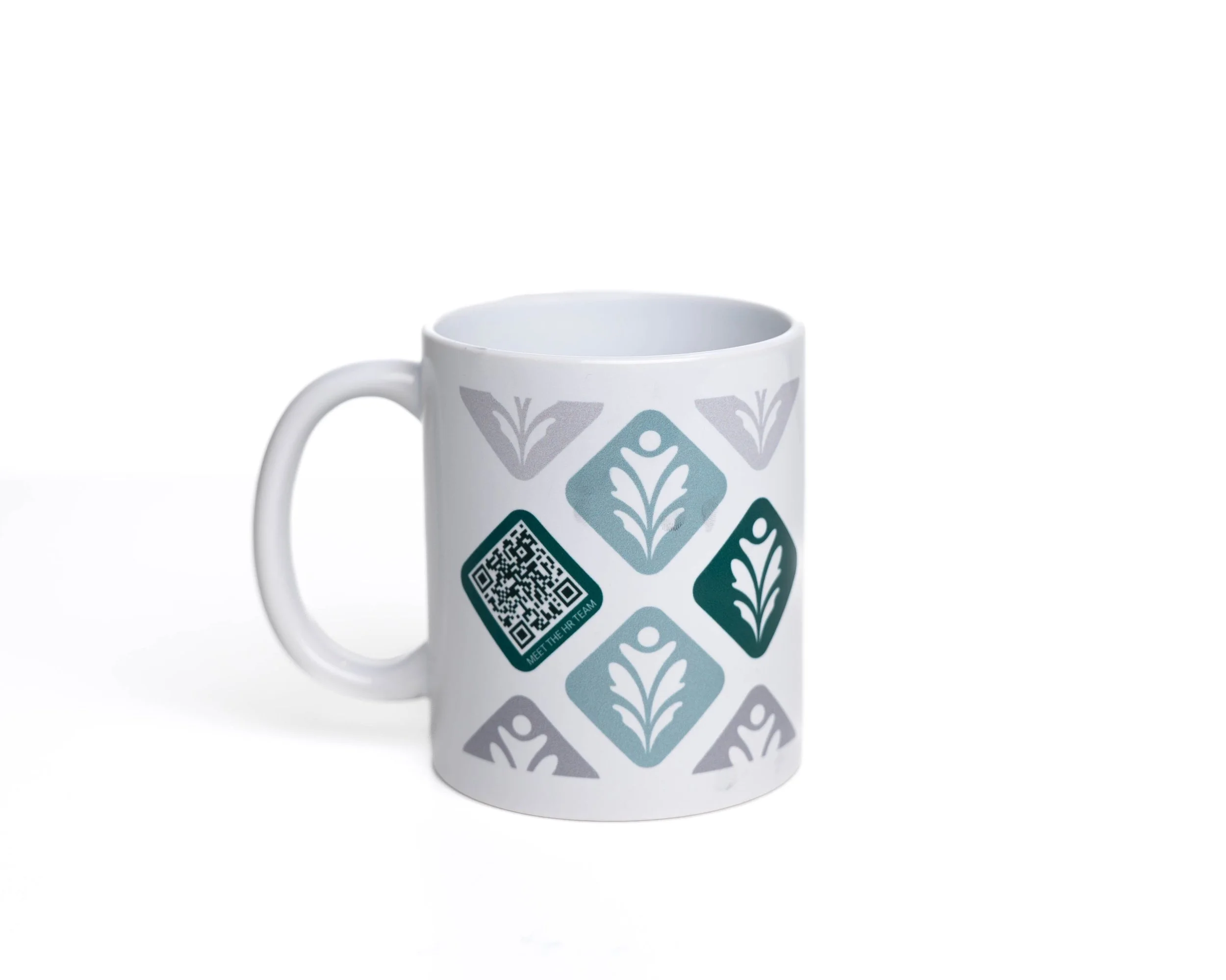
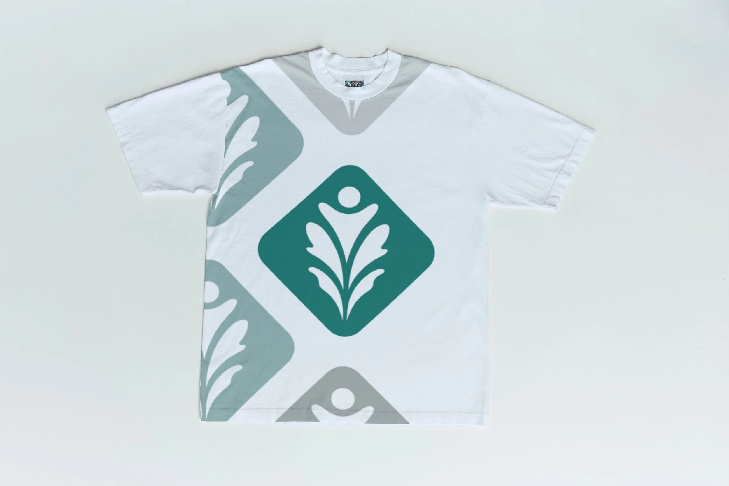
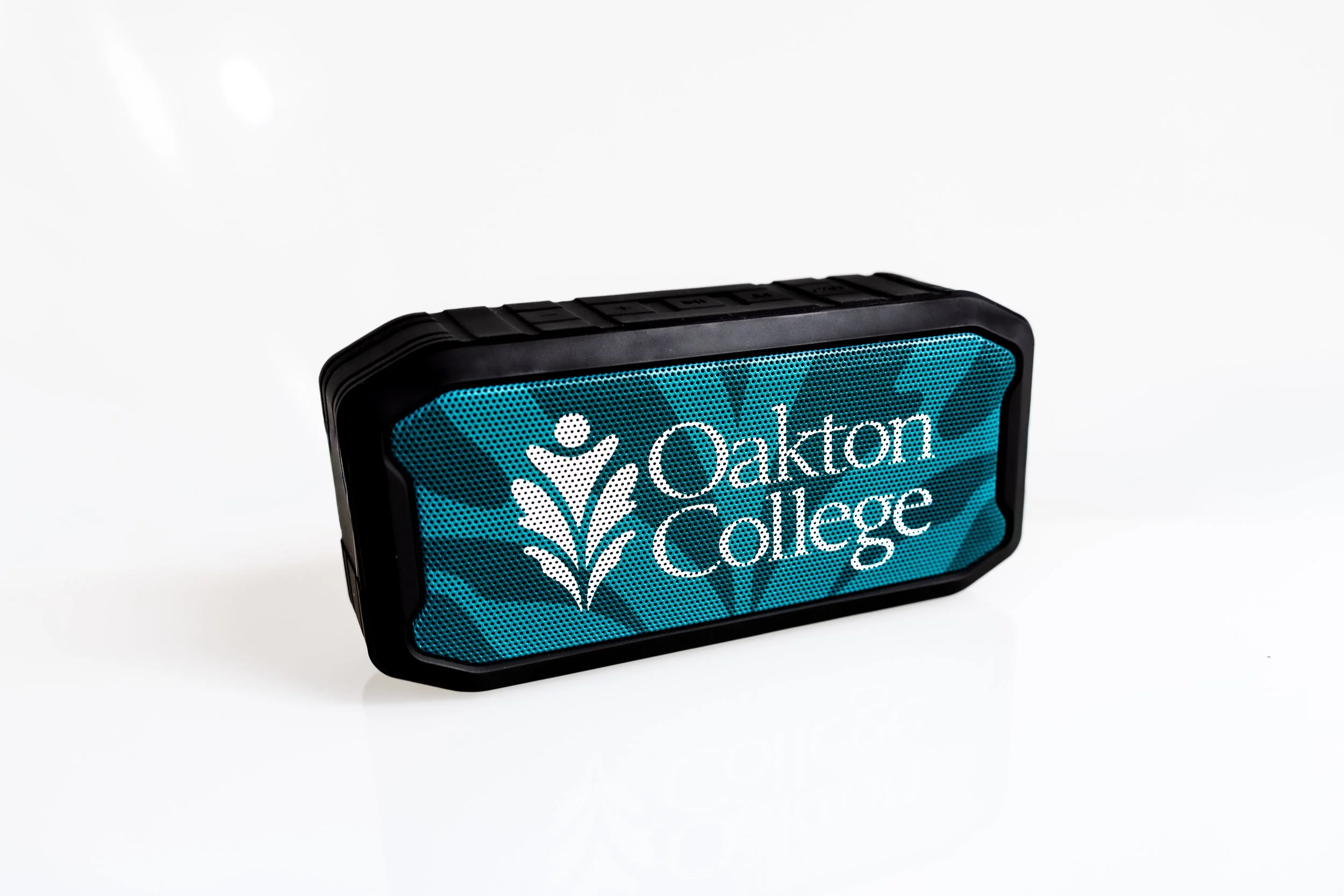
Promotional Items
Building on the positive feedback from earlier projects, I was asked to collaborate on a new set of promotional items that reflected Oakton College’s brand identity. The collection included a branded mug, a stainless steel water bottle, a stress-relief figure, and a pen—all designed to align with Oakton’s visual identity and appeal to both staff and students.
This project required close collaboration with multiple departments across campus to understand their needs and ensure the designs supported their goals. I also worked directly with external vendors to manage production, adapting my designs to meet specific technical requirements while maintaining consistency across different materials and formats.
One standout feature was the mug, which incorporated a custom QR code linking employees to digital resources—a small but impactful way to merge physical design with functionality.
This experience gave me hands-on insight into real-world production workflows, cross-departmental communication, and the challenges of designing for print and merchandise while staying true to brand integrity.


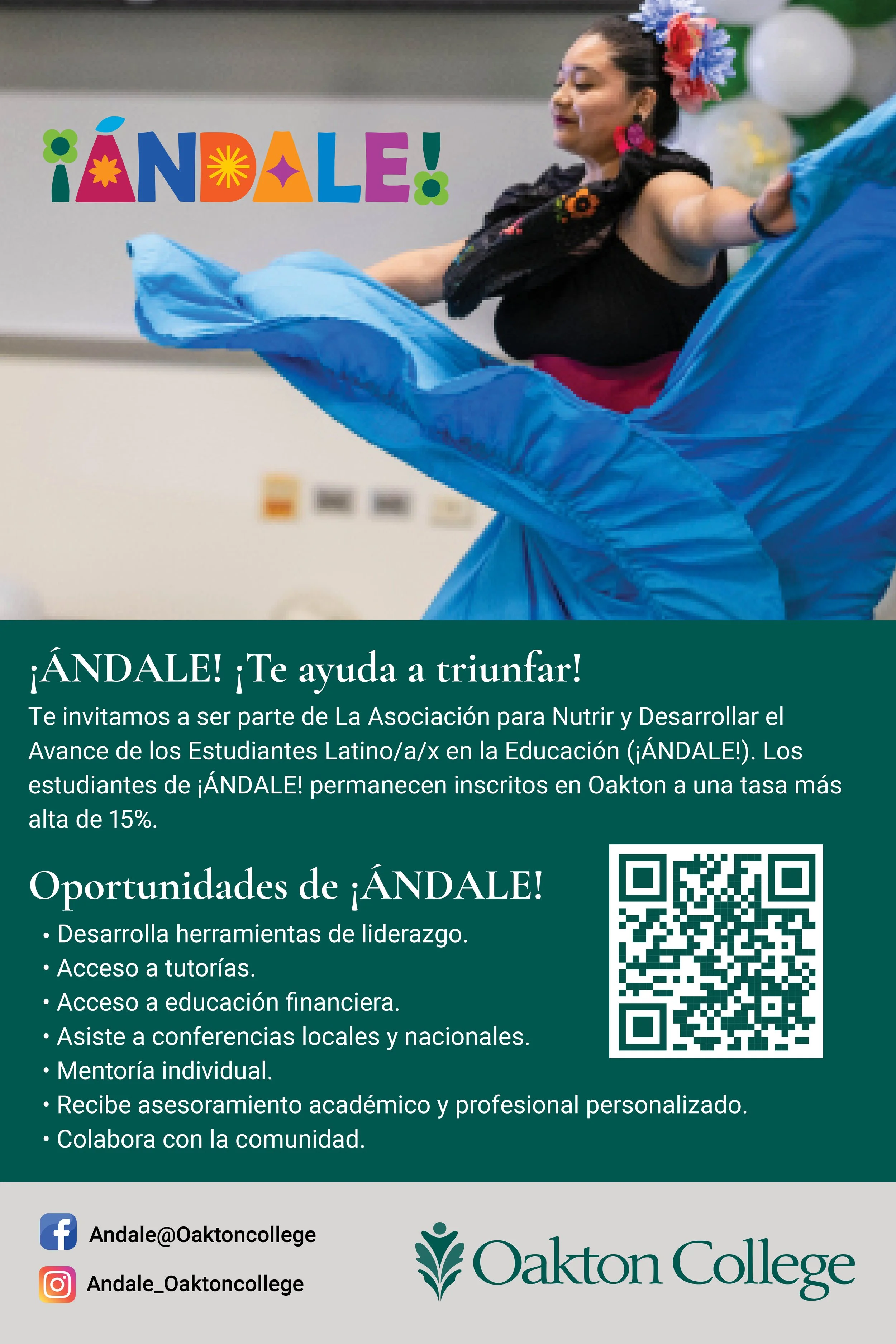
ÁNDALE!
Palm Card Design

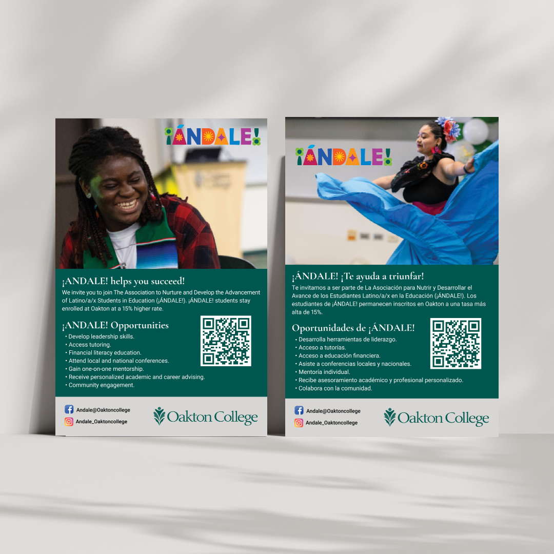
This promotional palm card was designed to support Oakton College’s ÁNDALE! program, which empowers Latino/a/x students through mentorship, leadership development, and academic resources.
While the photography was provided, I crafted the overall layout, seamlessly integrated the college’s branding, and adapted the messaging to align with institutional guidelines.
A key consideration for this project was creating two versions of the palm card—one in English and one in Spanish—to ensure accessibility and inclusivity for the diverse student community.
The final design strikes a balance between clear, accessible communication and a vibrant, welcoming aesthetic, specifically tailored to engage and inspire the student audience.
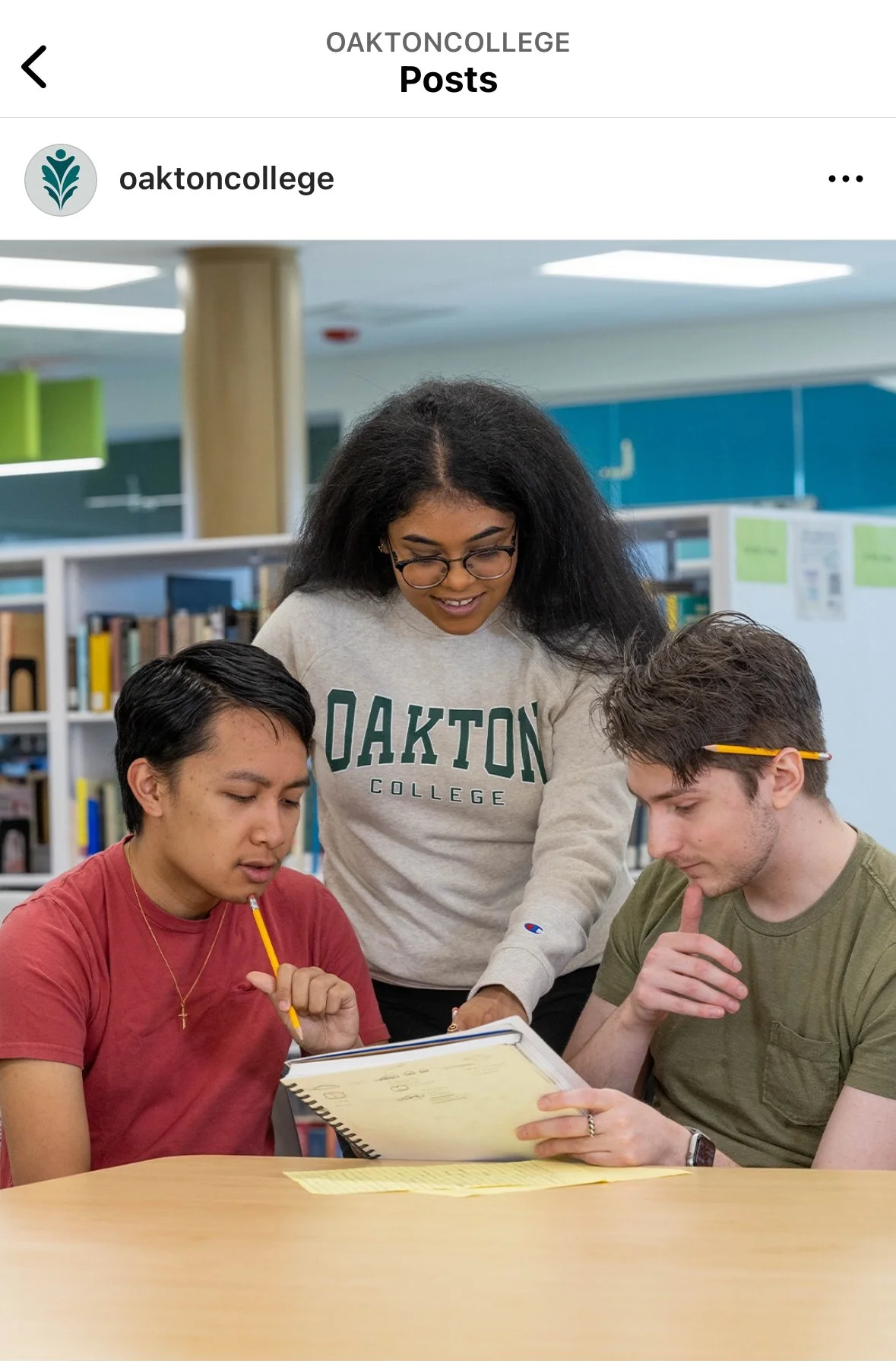
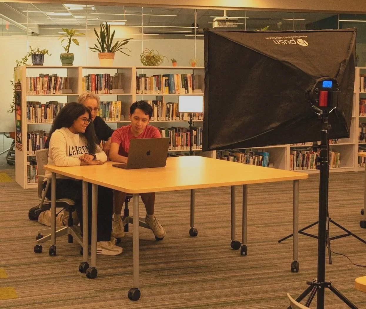
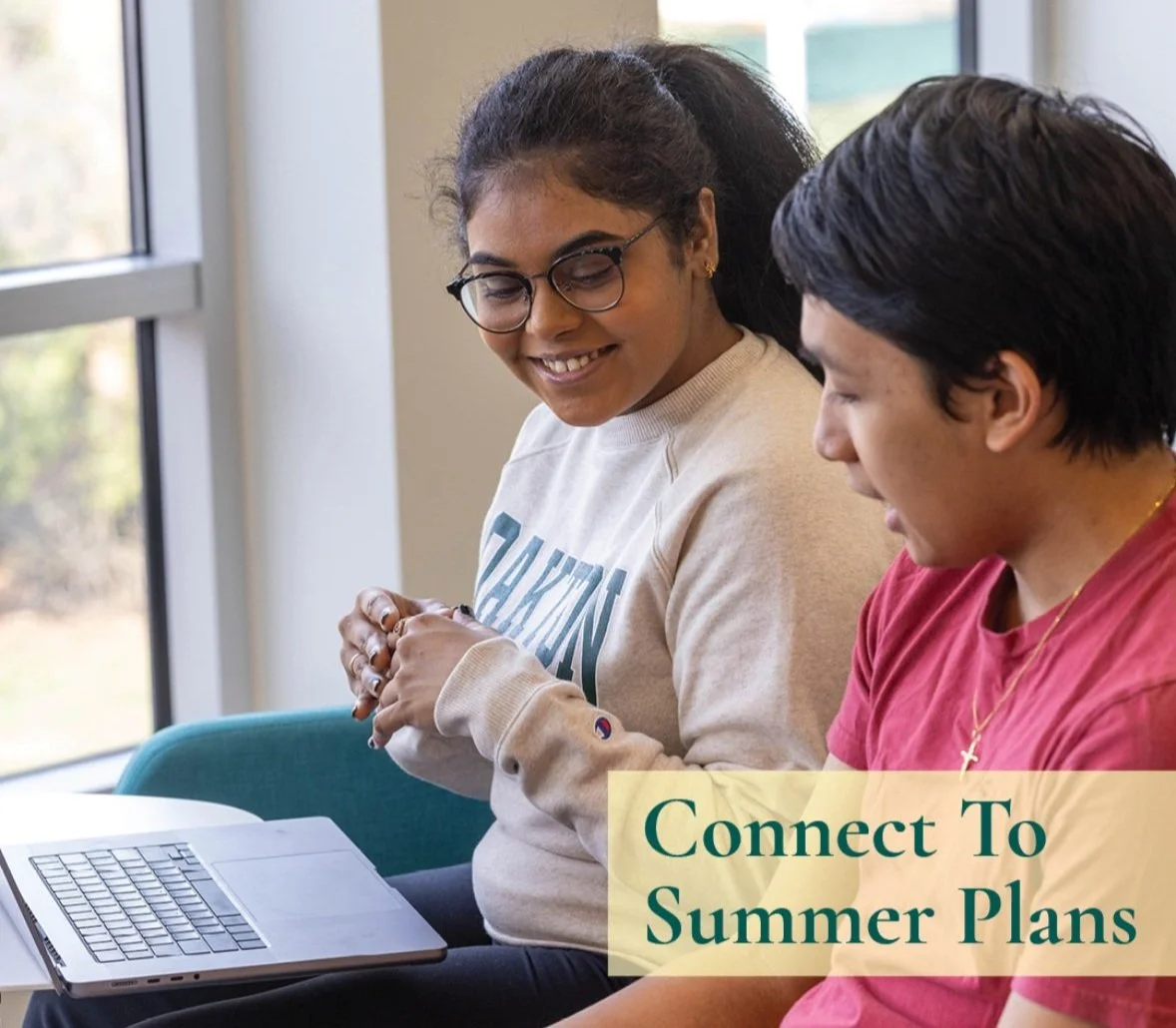
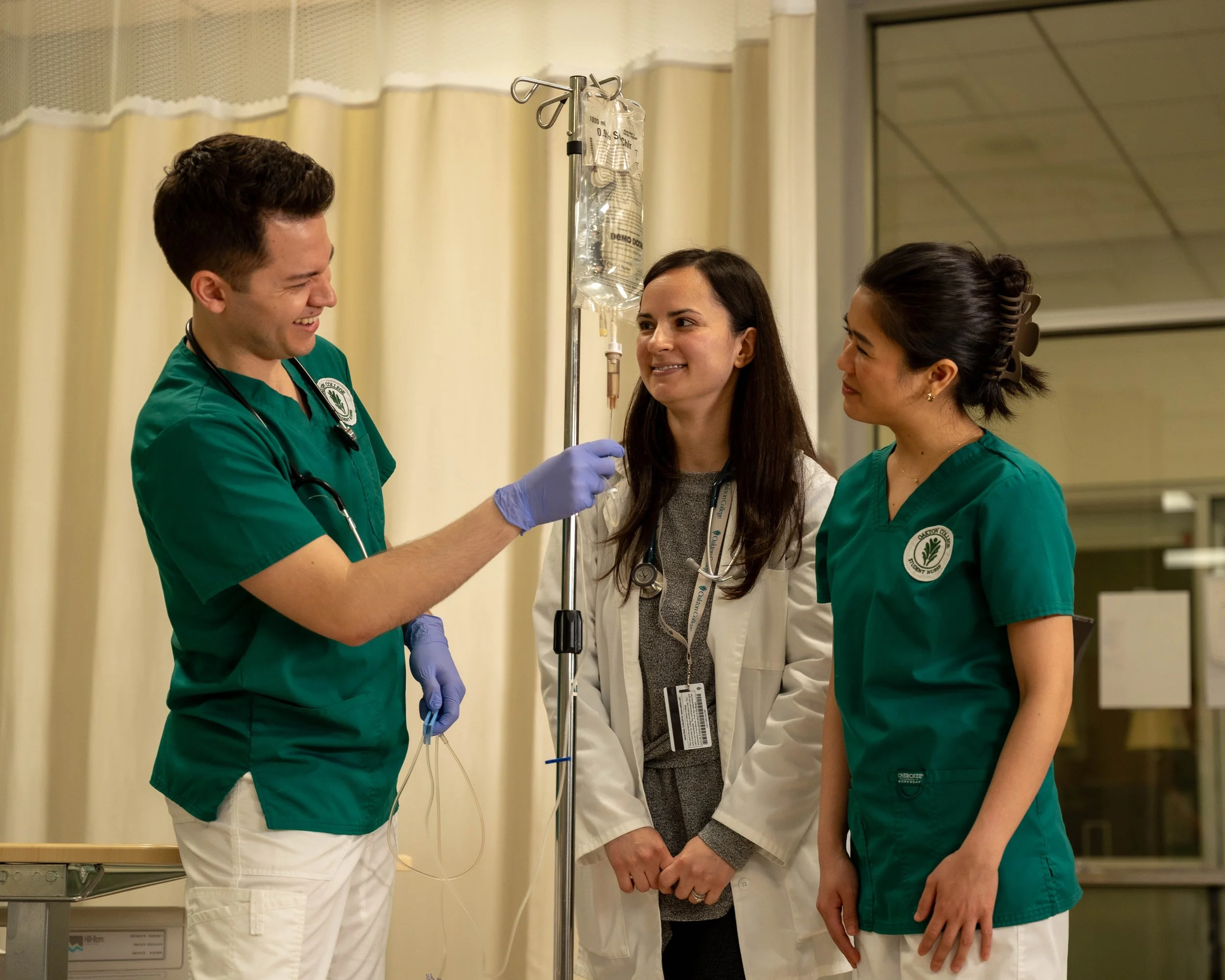
ad campaign
Collaborated with Oakton’s Marketing Department to develop a comprehensive Ad campaign promoting the college’s programs. Contributed from concept to execution. Creating mood boards, casting student models, coordinating logistics, and producing original photographic content for both print and digital platforms